Aug 16, 2024
Creating Unforgettable Product/User Experiences (That Users Actually Love)
Hey there! Let me ask you something:
What's the last product or service that absolutely wowed you?
Maybe it was an app that felt like it read your mind. Or a coffee shop where everything from the music to the mug, just felt right. Now think: Why do you remember that experience so clearly?
Here's the thing: Unforgettable experiences don't happen by accident. Whether it's a killer mobile app, a brick-and-mortar store, or even a government website (yes, really!), the best experiences are carefully crafted using a mix of psychology, design, and a little bit of magic. In this deep dive, we're going to break down exactly how to create those "wow" moments that keep users coming back.
Let’s explore how to craft those unforgettable "wow" moments that keep users engaged and coming back. We’ll combine practical design insights with psychological principles to build a clear framework. By the end, you’ll have a step-by-step guide for creating experiences that go beyond functionality and spark happiness in users, leaving a lasting impression.
What Actually Is an Experience?
First, let’s define what an experience really is. Think of it like this:
Experience = Environment + Entities + Actions + Results + Emotions + Time
Sounds a bit academic, right? Let me translate this into plain English with some real-world examples.
1. Environment: The "Where" Matters More Than You Think
Imagine texting your crush. Now imagine doing it:
- Scenario 1: Cozy bed, phone at 100%, WiFi strong
- Scenario 2: Crowded subway, 3% battery, spotty service
Same action (texting), wildly different experiences. That's environment at work.
Design Tip:
Primary environment = Where the main interaction happens (your app/website)
Secondary environment = Everything around it (user's phone, location, even their mood)
Example:
Netflix knows you're probably watching on a couch at night, so they use dark mode to reduce eye strain. Smart, right?
2. Entities: The "Who" and "What" of the Experience
Every experience is built on three core entities: people (users, designers, support teams), objects (buttons, banners, visual elements), and concepts (brand voice, usability principles). Together, they form the ecosystem of interactions—where thoughtful alignment between human needs, tangible components, and intangible guidelines transforms functional design into meaningful experiences. Get this harmony right, and your product doesn’t just work it resonates.
People (you, the designer, customer support).
Objects (buttons, images, that annoying cookie banner).
Concepts (your brand's personality, usability rules).
Fun Example:
In Slack, the "typing..." indicator isn't just text, it's a tiny entity that reduces anxiety. (Nobody likes shouting into the void!) .
3. Actions: The "Doing" Part
Every user experience boils down to a sequence of actions whether digital taps and swipes or physical gestures like signing a receipt, where efficiency reigns supreme. The golden rule? Minimize steps relentlessly: each additional click or swipe isn’t just friction, it’s a chance for abandonment, making streamlined flows (like Amazon’s 1-Click ordering) the ultimate competitive advantage. Reduce actions ruthlessly, and you amplify both usability and delight.
Golden Rule:
The fewer actions needed to do something, the better.
Case Study:
Amazon's "1-Click Ordering" isn't just convenient—it exploits our laziness (in the best way possible). Fewer steps = fewer chances to bail.
4. Results: Did That Actually Work?
Nothing kills user confidence faster than unresponsive interactions that dreaded moment when you click and get silence. Great experiences eliminate this uncertainty through instant, multi-sensory feedback: visual cues like checkmark animations confirm actions, auditory signals (think cash register "cha-chings") reward purchases, and tactile responses (like message-sent vibrations) create physical reassurance. These micro-feedbacks transform digital interactions from questionable to satisfying, proving the system's reliability through immediate, instinctive confirmation.
Visual (a checkmark animation)
Auditory (a "cha-ching!" sound when you make a purchase)
Tactile (your phone vibrating when you send a message)
Design Tip:
No feedback = User panic. Always confirm actions.
5. Emotions: The Secret Sauce
At the core of every memorable product or service lies a simple truth: people may forget what you built, but they'll always remember how you made them feel. This isn't just poetic thinking - it's neurological fact. Our brains are wired to prioritize emotional responses over rational analysis because feelings require less cognitive effort. That's why users will abandon a technically perfect product that frustrates them, while passionately loyal to flawed ones that make them happy.
The implications for designers are profound. Every interaction - from a button click to a customer support call - is an emotional transaction. When users encounter your product, they're not just completing tasks; they're subconsciously asking: "Does this make me feel competent or confused? Valued or exploited? Delighted or disappointed?" These emotional responses become the invisible scorecard that determines whether your experience succeeds or fails.
Consider the science behind this: studies show emotional engagement drives up to 95% of purchasing decisions, and emotionally connected customers deliver 3x higher lifetime value. This explains why companies like Apple invest obsessively in the visceral pleasure of unboxing a product, or why Duolingo turns language learning into a game full of celebratory animations. They're not just designing interfaces - they're engineering emotional journeys.
The 3 Levels of Emotional Design (Don Norman’s Framework)
Visceral (First impressions):
Looks, sounds, haptics.
Example: Apple’s unboxing experience.
Behavioral (Usability):
Does it work smoothly?
Example: Google Search’s instant results.
Reflective (Long-term meaning):
Pride, nostalgia, loyalty.
Example: Nike’s "Just Do It" ethos.
This emotional lens changes everything about how we evaluate design success. Instead of just tracking conversion rates or task completion, we must ask: What feelings are we creating? Are we designing for short-term dopamine hits or long-term emotional loyalty? The answers determine whether our products become forgettable utilities or beloved companions in users' lives.
Because when the technology fades into the background, what remains is how you made people feel - and that's what they'll remember.
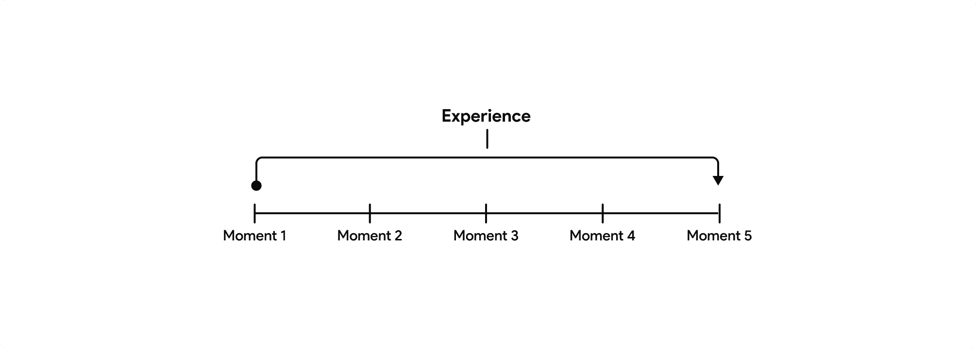
6. Time: Moments and Events
Time fundamentally shapes user experiences, spanning from fleeting micro-interactions (like instant notifications) to enduring journeys (like multi-week courses), where well-designed moments create immediate satisfaction while extended experiences build long-term engagement.
The most impactful products seamlessly integrate these temporal layers like Spotify blending instant playback with daily mixes and annual Wrapped summaries—to deliver both instant gratification and sustained value, ensuring experiences feel responsive in the moment while deepening user relationships over time.
Moments : These are instantaneous (micro-interactions, like liking a post).
Extended Experiences : they occur over a period of time (longer journeys, like completing a course).
Design Insight:
A single bad moment (e.g., a broken checkout button) can ruin an entire extended experience.
Example:
Spotify’s "Wrapped" campaign works because it’s a year-long story told through bite-sized, shareable moments.
Predicting Future Experiences
Ever wonder how people form instant judgments about your product? It all comes down to this powerful psychological formula: Their current experience is shaped by past interactions with similar products combined with the most emotionally charged moments they remember. In other words, users don’t just evaluate you in isolation; they compare you to every other product they’ve ever used, especially the ones that made them feel strongly. This means standing out requires more than just functionality it demands creating moments so positively memorable that they redefine expectations.
Here’s the surprising truth about how users really perceive your product:
Current Experience = Past Related Experiences + Experience with Strongest Emotions
In short? You’re not just competing with rivals—you’re up against every memory, good or bad, that users associate with similar experiences.
The "This Looks Sketchy" Effect
Ever seen a login form and thought *"This feels phishy?"* That’s past experiences talking.
Design Fixes:
Use familiar patterns (shopping cart icon = checkout)
Borrow trust signals (padlock icons, verified badges)
Avoid dark patterns (hidden fees, sneaky opt-ins)
The "Apple Effect"
Why does Apple’s ecosystem feel so intuitive? Consistency. Swipe gestures, app layouts, even packaging it all feels the same.
Takeaway:
Leverage what users already know. Reinventing the wheel just confuses people.