OPNR Redesign
OPNR
COMPANY
OPNR
ROLE
Product Designer
Industry
SaaS
YEAR
2023
Project Description
OPNR connects emerging musicians with live performance opportunities by securing opening slots at concerts and venues.
After successfully developing a monetization strategy that brought in $25,000 in funding and attracted new users with improved features, I led the redesign of OPNR's landing page. The main goal was to make the platform better at helping new musicians get opening performance slots. This involved creating a landing page that was both visually appealing and easy to use, while clearly showing how OPNR can help artists advance their careers.
The redesign was guided by market research, competitor analysis, and product feedback to make the platform easier to use and better aligned with OPNR's goals. The focus was on improving how musicians discover and join the platform, clearly showcasing what makes OPNR unique, and creating a stronger first impression that highlights how it helps artists connect with opportunities to grow their careers.

Problem
The existing landing page didn't align well with the company's goals, didn't engage users effectively, and needs improvement in the overall product experience.
Objectives
Improve clarity of offering and user onboarding
Align UI with business growth strategy
Increase interaction, retention, and conversion
Role
Led UX research, competitor analysis, user journey mapping, and the full UI redesign with prototyping and testing.
Timeline
6 weeks
Team
Product Designer, Business stakeholders, PM, Front End Dev
Design Process
The process followed a research-driven approach, focused on strategy and measurable results. Every decision was supported by competitive analysis, usability best practices, and growth objectives.

Discovery
Reviewed OPNR’s mission, vision, and goals to understand product direction
Conducted a product audit of the original landing page
Performed market and competitor analysis to identify UI and UX opportunities
Tools and Methodology
Tools: Figma, Google Slides, Notion
Activities: Product audit, competitor benchmarking, UX strategy alignment, interactive prototyping
Methodology: User-centered design with strategic business alignment
Define
Problem Statement Definition
How might we design a landing page experience that clearly communicates OPNR’s value to musicians, increases trust, and drives user conversion?
Scope
Design a landing page with clear and easy navigation to improve users experience.
Research
The research began with an analysis of existing business data. This revealed three unique user groups, rather than the two originally assumed by the client. This insight helped refine audience targeting and informed more effective design decisions.
Understanding the Talent Landscape
Desk research provided a clearer picture of the musician workforce in the U.S.:
As of 2022, there were approximately 103,000 musicians.
60.5% were male, while 39.5% were female.
Talent Cluster
Musicians tend to cluster in major metro areas. The top cities with the highest concentration of musical talent include:
Los Angeles
New York
Nashville
Orlando
Event Cluster
Research into event hotspots revealed that the following cities consistently rank high for live music opportunities due to vibrant local scenes:
New York
Los Angeles
Chicago
These insights played a key role in shaping the platform’s design and targeting strategy, ensuring it resonated with the right audiences in the right locations.

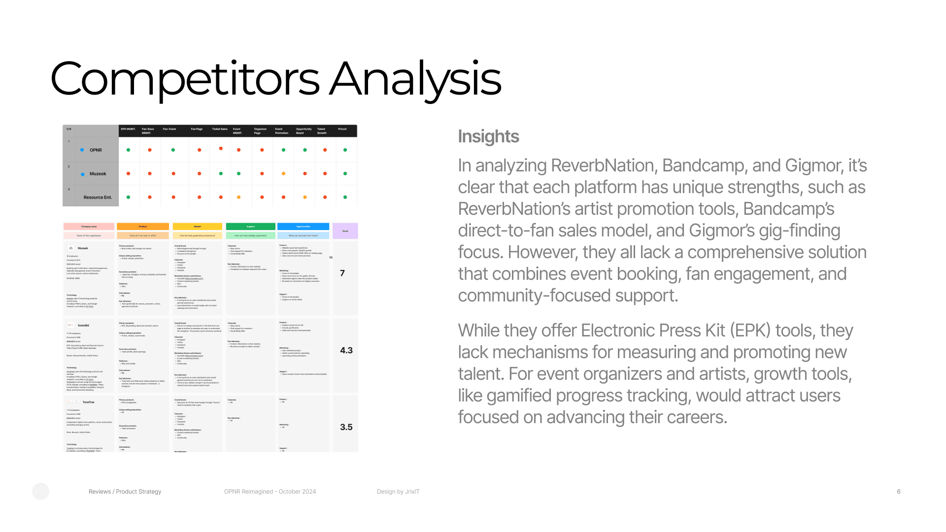
Competitor Analysis
The next phase involved analyzing direct competitors such as ReverbNation, Bandcamp, and Gigmor. This analysis helped identify gaps and opportunities where OPNR could stand out. Key areas of focus included:
Unique value propositions offered by each platform
User experience flows and onboarding
Monetization strategies and engagement features
Insights from this research directly informed enhancements to OPNR’s offering, ensuring the platform delivered unique experience for emerging talents and event managers.
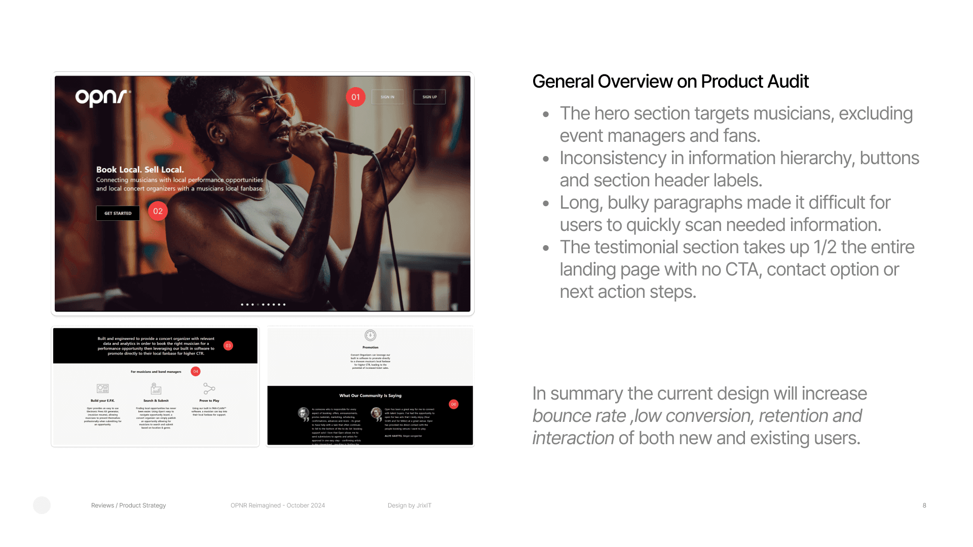
Product Audit
The product was audited based on usability heuristics, to measuring user experience and finding out areas for improvement.
The hero section speaks only to musicians, unintentionally excluding other important users like event managers and fans.
Inconsistent UI Elements:
There were noticeable inconsistencies in information hierarchy, button styles, and section headers—making the interface feel unpolished and harder to navigate.Text-Heavy Layout:
Long, bulky paragraphs made it difficult for users to quickly scan and find the information they need.Overextended Testimonial Section:
The testimonial section took up nearly half of the landing page, with no call-to-action, contact option, or clear next steps—leaving users unsure of where to go next.
Solution Design
After completing the discovery and research phases, we moved into the solution phase with clear success metrics in mind.
To measure the effectiveness of the redesigned OPNR landing page, we focused on the following key performance indicators:
Conversion Rate.
Bounce Rate.
Click-Through Rate (CTR).
User Retention.
These metrics provided a clear way to evaluate the impact of our design decisions and continuously improve the user experience.
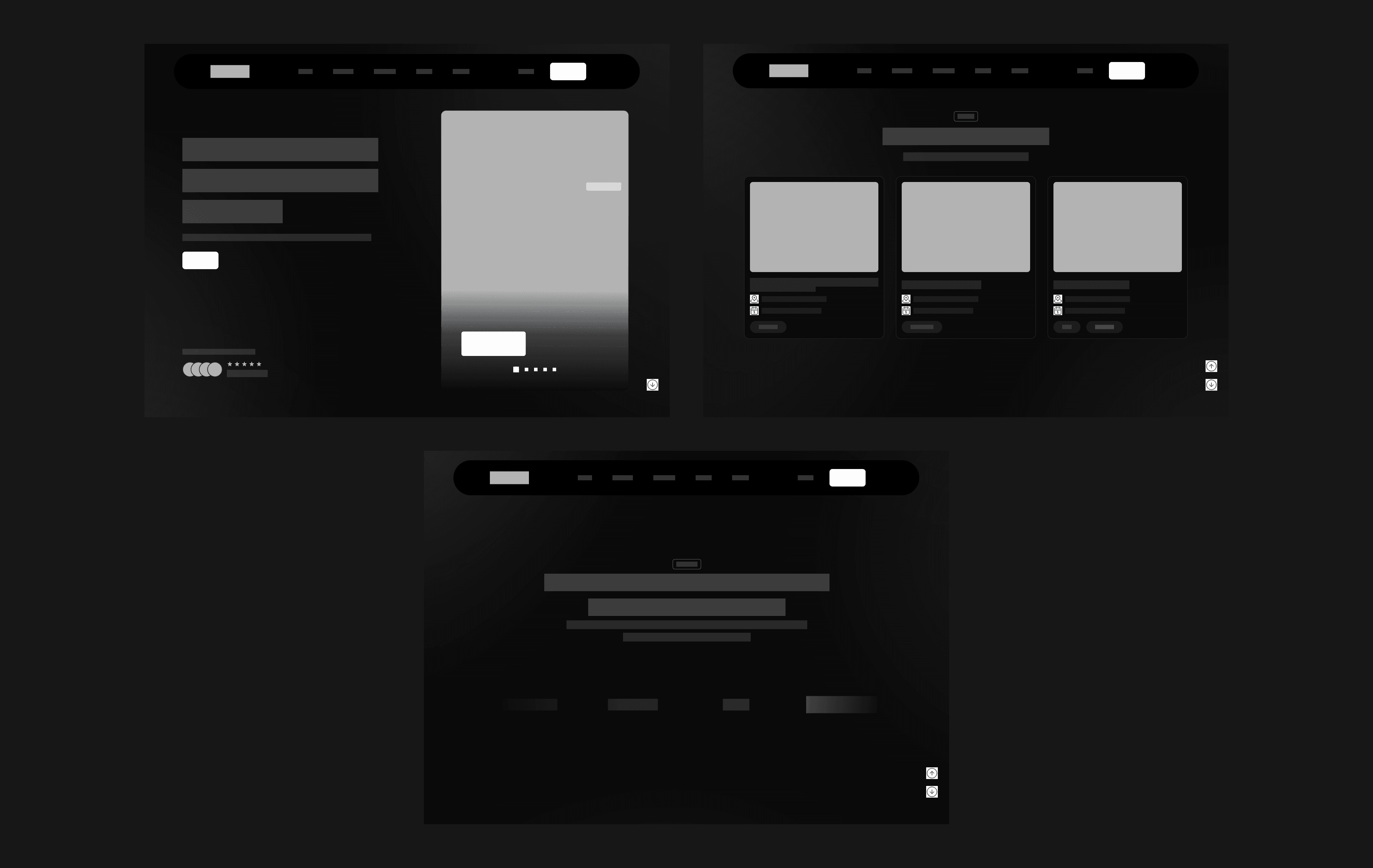
Low Fidelity
To explore layout ideas and test user flow early on, we created low-fidelity wireframes. They allowed for quick feedback and fast iteration, helping us validate core concepts before moving into high-fidelity design.
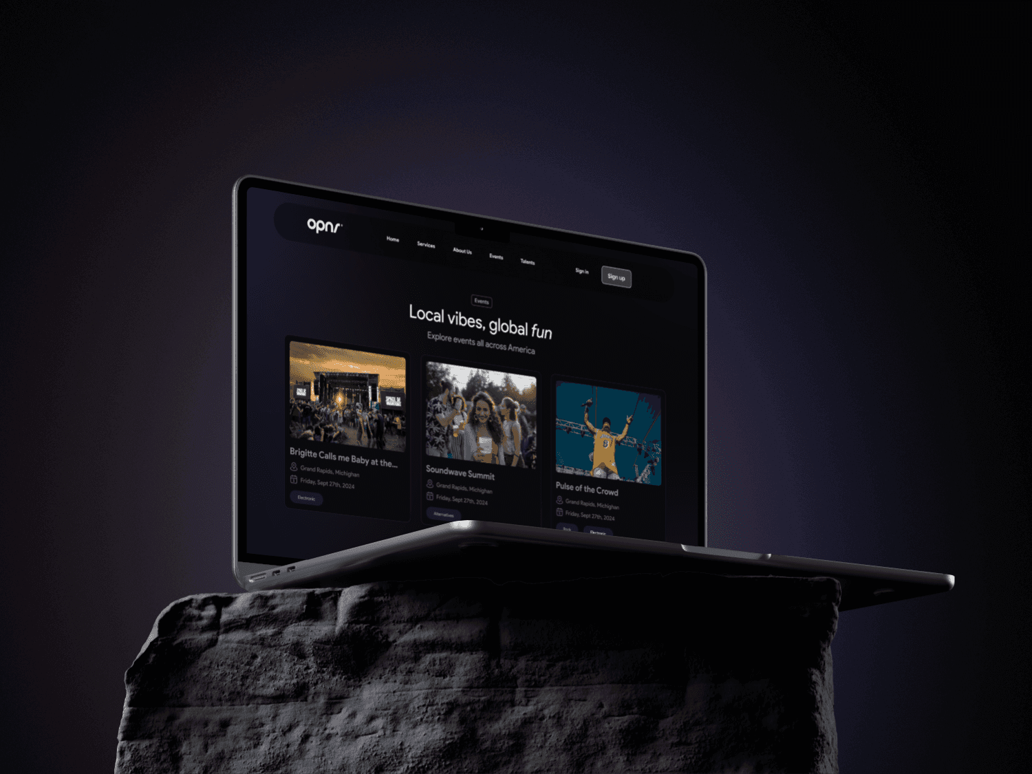
High Fidelity
With the layout and user flow validated through wireframes, we moved on to high-fidelity design. This stage brought the experience to life with polished visuals, consistent branding, and refined interactions.
The design focused on clarity, accessibility, and engagement featuring a clean layout, strong visual hierarchy, and clear calls-to-action. Every element was crafted to better communicate OPNR’s value, guide users effectively, and create a seamless, professional first impression.


Results and Impact
After testing the redesigned landing page led to these improvements for OPNR:
Users understand what OPNR offers within seconds of landing on the page.
A more organized layout and consistent design made the page easier to navigate and more enjoyable to use.
Clear call-to-action buttons and a focused layout, guides users toward signing up or exploring the platform further.
The updated design speaks not just to musicians, but also event managers and fans, expanding OPNR's reach.
The landing page supports OPNR’s goals to attract new users, build credibility, and drive conversions.